Initial Configuration
import os
import vulncheck_sdk
import matplotlib.pyplot as plt
import pandas as pd
import plotly.express as px
import calplot
from dotenv import load_dotenv

load_dotenv()

DEFAULT_HOST = "https://api.vulncheck.com"
DEFAULT_API = DEFAULT_HOST + "/v3"
TOKEN = os.environ["VULNCHECK_API_TOKEN"]
YEAR = 2025

# Configure the VulnCheck API client
configuration = vulncheck_sdk.Configuration(host=DEFAULT_API)
configuration.api_key["Bearer"] = TOKEN
Pull Data
import sys
import pandas as pd

sys.path.insert(0, "..")
from utils import load_df

raw = load_df("vulncheck-kev")
df_original = pd.DataFrame({
    "CVE":             raw["cve"].apply(lambda x: x[0] if x else None),
    "Vendor":          raw["vendor_project"],
    "Product":         raw["product"],
    "Ransomware":      raw["known_ransomware_campaign_use"],
    "Date Added":      raw["date_added"].str[:10],
    "CISA Date Added": raw["cisa_date_added"].apply(lambda x: x[:10] if isinstance(x, str) else "none"),
})
VulnCheck Known Exploited Vulnerabilities (KEV) catalog makes it easy for enterprises, government agencies, and vendors, to know which vulnerabilities have been reported as exploited in the wild.
KEV Statistics (2025 Year-to-Date)
df = df_original.copy()

df['Date Added'] = pd.to_datetime(df['Date Added'])
df['CISA Date Added'] = df['CISA Date Added'].replace('none', pd.NaT)
df['CISA Date Added'] = pd.to_datetime(df['CISA Date Added'], format='%Y-%m-%d', errors='coerce')

# Get the current date and calculate the number of months passed in the year
current_date = df['Date Added'].max()  # Use the latest date in 'Date Added'
months_passed = current_date.month if current_date.year == YEAR else 12  # Use full 12 months for past years

# VulnCheck KEV data for the specified year
df_vulncheck_year = df[df['Date Added'].dt.year == YEAR]
total_kevs_vulncheck = df_vulncheck_year['CVE'].nunique()
avg_kevs_per_month_vulncheck = total_kevs_vulncheck / months_passed

# CISA KEV data where 'CISA Date Added' is within the specified year
df_cisa_year = df[df['CISA Date Added'].dt.year == YEAR]
total_kevs_cisa = df_cisa_year['CVE'].nunique()
avg_kevs_per_month_cisa = total_kevs_cisa / months_passed

# Unique vendors and products for VulnCheck KEV
unique_vendors_vulncheck = df_vulncheck_year['Vendor'].nunique()
unique_products_vulncheck = df_vulncheck_year['Product'].nunique()

# Unique vendors and products for CISA KEV
unique_vendors_cisa = df_cisa_year['Vendor'].nunique()
unique_products_cisa = df_cisa_year['Product'].nunique()

stats_rows = [
    ("Total KEVs Added", total_kevs_vulncheck, total_kevs_cisa),
    ("Avg. KEVs per month", avg_kevs_per_month_vulncheck, avg_kevs_per_month_cisa),
    ("Unique Vendors", unique_vendors_vulncheck, unique_vendors_cisa),
    ("Unique Products", unique_products_vulncheck, unique_products_cisa),
]

stats_df = pd.DataFrame(
    stats_rows,
    columns=["Metric", "VulnCheck KEV", "CISA KEV"]
)

stats_df.loc[stats_df["Metric"].str.contains("Avg."), ["VulnCheck KEV", "CISA KEV"]] = stats_df.loc[
    stats_df["Metric"].str.contains("Avg."), ["VulnCheck KEV", "CISA KEV"]
].astype(int)

# Convert all values except the Metric column to int
stats_df["VulnCheck KEV"] = stats_df["VulnCheck KEV"].astype(int)
stats_df["CISA KEV"] = stats_df["CISA KEV"].astype(int)

styled_stats_df = stats_df.style \
    .set_properties(**{'text-align': 'center'}) \
    .set_table_styles([{'selector': 'th', 'props': [('text-align', 'center')]}]) \
    .set_table_attributes('style="width:100%; border-collapse: collapse;"') \
    .hide(axis="index")

styled_stats_df
Loading...
KEVs by Vendor and Product - Year-to-Date (Source: VulnCheck KEV)
df = df_original.copy()

# Convert 'Date Added' to datetime format
df['Date Added'] = pd.to_datetime(df['Date Added'], errors='coerce')

# Filter for entries where 'Date Added' is in the current year
current_year = df[(df['Date Added'].dt.year == YEAR)]

# Count occurrences by Vendor and Product for the current year
vendor_product_counts = current_year.groupby(['Vendor', 'Product']).size().reset_index(name='Counts')

# Truncate vendor and product names to 15 characters for readability
vendor_product_counts['Vendor'] = vendor_product_counts['Vendor'].str.slice(0, 15)
vendor_product_counts['Product'] = vendor_product_counts['Product'].str.slice(0, 15)

# Create a treemap with both Vendor and Product levels
fig = px.treemap(vendor_product_counts, path=['Vendor', 'Product'], values='Counts',
                 color='Counts', color_continuous_scale='Viridis')

# Customize the title and layout for dark mode with specific width and height
fig.update_layout(
    title=f"Known Exploited Vulnerabilities by Vendor and Product - {YEAR} (Source: VulnCheck KEV)",
    title_font=dict(size=20, color='white'),
    title_x=0.5,
    paper_bgcolor='black',
    plot_bgcolor='black',
    margin=dict(t=50, l=25, r=25, b=25),
    width=1800,
    height=1000
)

# Remove color bar by setting coloraxis_showscale to False
fig.update_coloraxes(showscale=False)

# Use default font for labels inside the treemap (Arial) by removing custom font settings
fig.update_traces(
    texttemplate='%{label}<br> %{value}',
    textfont_size=16,
    textfont_color='white'
)

# Display the figure
fig.show()
Loading...
KEVs by Vendor and Product - Year-to-Date (Source: CISA KEV)
df = df_original.copy()

# Step 2: Convert 'CISA Date Added' to datetime format with a specified format
# Replace '%Y-%m-%d' with the actual format of your dates if different
df['CISA Date Added'] = pd.to_datetime(df['CISA Date Added'], format='%Y-%m-%d', errors='coerce')

# Step 3: Drop rows where 'CISA Date Added' could not be parsed
df.dropna(subset=['CISA Date Added'], inplace=True)

# Step 4: Filter for entries where 'CISA Date Added' is from this year
filtered_data = df[df['CISA Date Added'].dt.year == YEAR]

# Step 5: Count occurrences by Vendor and Product for entries with CISA Date Added in this year
vendor_product_counts = filtered_data.groupby(['Vendor', 'Product']).size().reset_index(name='Counts')

# Truncate vendor and product names to 15 characters for readability
vendor_product_counts['Vendor'] = vendor_product_counts['Vendor'].str.slice(0, 15)
vendor_product_counts['Product'] = vendor_product_counts['Product'].str.slice(0, 15)


# Create a treemap with both Vendor and Product levels
fig = px.treemap(vendor_product_counts, path=['Vendor', 'Product'], values='Counts',
                 color='Counts', color_continuous_scale='Viridis')

# Customize the title and layout for dark mode with specific width and height
fig.update_layout(
    title=f"Known Exploited Vulnerabilities by Vendor and Product - {YEAR} CISA Entries (Source: CISA KEV)",
    title_font=dict(size=20, color='white'),
    title_x=0.5,
    paper_bgcolor='black',
    plot_bgcolor='black',
    margin=dict(t=50, l=25, r=25, b=25),
    width=1800,
    height=1000
)

# Remove color bar by setting coloraxis_showscale to False
fig.update_coloraxes(showscale=False)

# Use default font for labels inside the treemap (Arial) by removing custom font settings
fig.update_traces(
    texttemplate='%{label}<br> %{value}',
    textfont_size=16,  # Font size for readability
    textfont_color='white'  # Font color
)

# Display the figure
fig.show()
Loading...
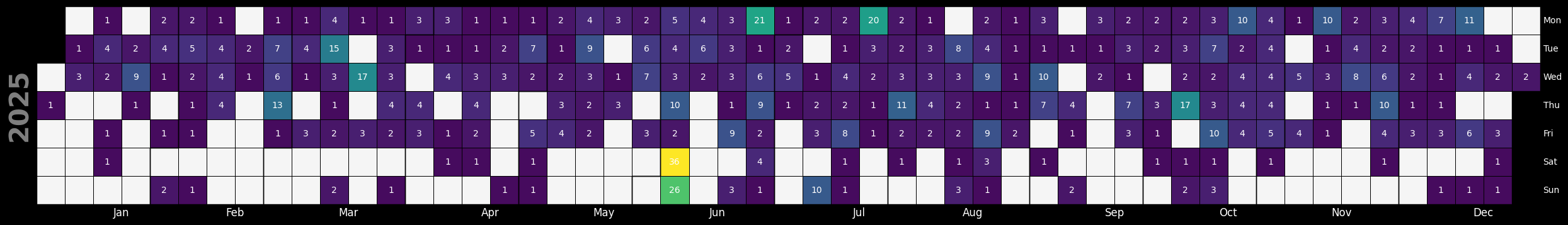
KEVs by Day - Year-to-Date (Source: Vulncheck KEV)
df = df_original.copy()

# Title text
title_text = f"First Seen Exploitation Evidence per Unique CVE in {YEAR} (Source: VulnCheck KEV)"

# Step 1: Convert 'Date Added' to datetime format, handling errors
df['Date Added'] = pd.to_datetime(df['Date Added'], errors='coerce')

# Step 2: Drop rows where 'Date Added' could not be parsed
df = df.dropna(subset=['Date Added'])

# Step 3: Filter for entries where 'Date Added' is from this year
df_filtered = df[df['Date Added'].dt.year.isin([YEAR])]

# Step 4: Count occurrences of each 'Date Added' date
date_counts = df_filtered['Date Added'].value_counts().sort_index()

# Step 5: Convert the counts to a DataFrame for plotting
date_counts_df = date_counts.to_frame(name='Counts')

# Step 6: Set a continuous date range from Jan 1 to Dev 31
full_date_range = pd.date_range(start=f"{YEAR}-01-01", end=f"{YEAR}-12-31")

# Step 7: Reindex the DataFrame with the full date range, filling missing dates with zero counts
date_counts_df = date_counts_df.reindex(full_date_range, fill_value=0)

# Step 8: Plot the calendar heatmap for each year from this year using calplot
fig, ax = calplot.calplot(
    date_counts_df['Counts'],
    cmap='viridis',
    vmin=0,
    vmax=date_counts_df['Counts'].max(),
    colorbar=False,
    dropzero=True,
    edgecolor="black",
    textcolor="white",
    textformat='{:.0f}',
    figsize=(25, 10),
    yearascending=False,
    yearlabel_kws={'fontname':'sans-serif'}
)

# Set the figure and axes background to black
fig.patch.set_facecolor('black')
for a in ax:
    a.set_facecolor('black')

# Modify the month and day labels to be white
for a in ax:
    # Set month labels to white
    for label in a.get_xticklabels():
        label.set_color("white")
        label.set_fontsize(12)
        label.set_fontfamily('sans-serif')
    # Set day labels to white
    for label in a.get_yticklabels():
        label.set_color("white")
        label.set_fontsize(10)
        label.set_fontfamily('sans-serif')

# Manually add black borders around each day cell
for a in ax:
    for collection in a.collections:
        collection.set_edgecolor("black")
        collection.set_linewidth(0.5)

plt.show()
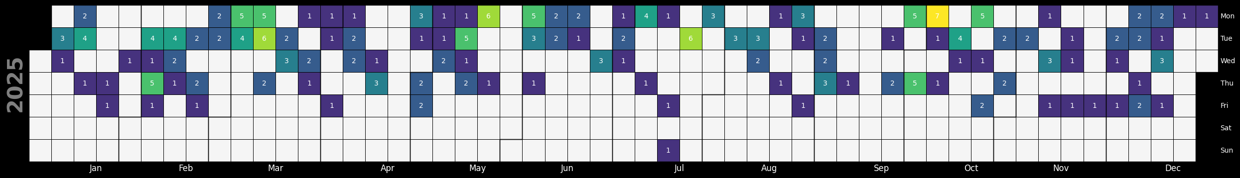
KEVs by Day - Year-to-Date (Source: CISA KEV)
df = df_original.copy()

# Title text
title_text = f"CISA KEV Added Date per Unique CVE in {YEAR} (Source: CISA KEV)"

# Step 1: Convert 'CISA Date Added' to datetime format, handling errors
df['CISA Date Added'] = pd.to_datetime(df['CISA Date Added'], errors='coerce', format='mixed')

# Step 2: Drop rows where 'CISA Date Added' could not be parsed
df.dropna(subset=['CISA Date Added'], inplace=True)

# Step 3: Filter for entries where 'CISA Date Added' is from the current year
df_filtered = df[df['CISA Date Added'].dt.year == YEAR]

# Step 4: Count occurrences of each 'CISA Date Added' date
date_counts = df_filtered['CISA Date Added'].value_counts().sort_index()

# Step 5: Convert the counts to a DataFrame for plotting
date_counts_df = date_counts.to_frame(name='Counts')

# Step 6: Set a continuous date range from Jan 1 to Dev 31
full_date_range = pd.date_range(start=f"{YEAR}-01-01", end=f"{YEAR}-12-31")

# Step 7: Reindex the DataFrame with the full date range, filling missing dates with zero counts
date_counts_df = date_counts_df.reindex(full_date_range, fill_value=0)

fig, ax = calplot.calplot(
    date_counts_df['Counts'],
    cmap='viridis',
    vmin=0,
    vmax=date_counts_df['Counts'].max(),
    colorbar=False,
    dropzero=True,
    edgecolor="black",
    textcolor="white",
    textformat='{:.0f}',
    figsize=(25, 10),
    yearascending=False,
    yearlabel_kws={'fontname':'sans-serif'}
)

# Set the figure and axes background to black
fig.patch.set_facecolor('black')
for a in ax:
    a.set_facecolor('black')

# Modify the month and day labels to be white
for a in ax:
    # Set month labels to white
    for label in a.get_xticklabels():
        label.set_color("white")
        label.set_fontsize(12)
        label.set_fontfamily('sans-serif')
    # Set day labels to white
    for label in a.get_yticklabels():
        label.set_color("white")
        label.set_fontsize(10)
        label.set_fontfamily('sans-serif')

# Manually add black borders around each day cell
for a in ax:
    for collection in a.collections:
        collection.set_edgecolor("black")
        collection.set_linewidth(0.5)

plt.show()
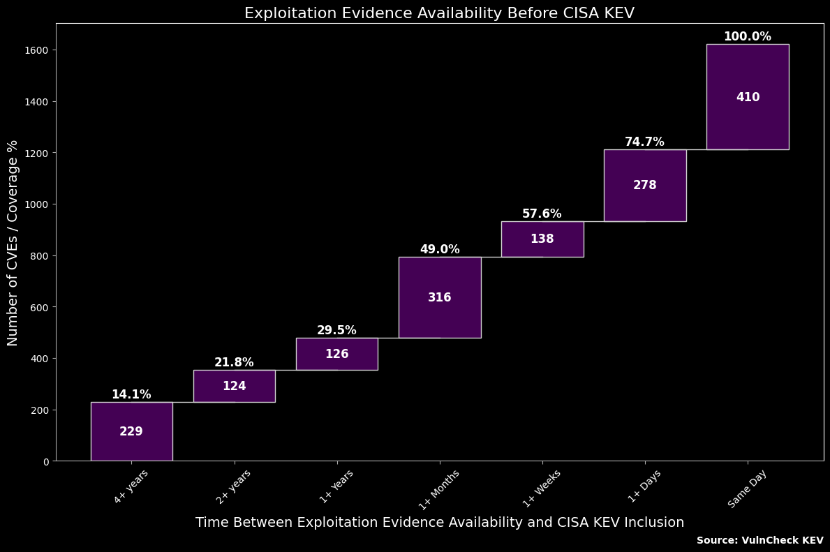
Exploitation Evidence Availability Before CISA KEV
df = df_original.copy()

# Ensure 'Date Added' and 'CISA Date Added' are in datetime format
df['Date Added'] = pd.to_datetime(df['Date Added'], errors='coerce', format='mixed')
df['CISA Date Added'] = pd.to_datetime(df['CISA Date Added'], errors='coerce', format='mixed')

# Calculate 'Days Between' as the difference in days
df['Days Between'] = df.apply(
    lambda row: (row['CISA Date Added'] - row['Date Added']).days if pd.notnull(row['CISA Date Added']) else "none",
    axis=1
)

# Define the function to categorize the time intervals based on 'Days Between'
def categorize_time(days):
    if days == "none":
        return "none"
    elif days >= 1460:
        return '4+ years'
    elif 730 <= days < 1460:
        return '2+ years'
    elif 365 <= days < 730:
        return '1+ Years'
    elif 31 <= days < 365:
        return '1+ Months'
    elif 7 <= days < 31:
        return '1+ Weeks'
    elif 1 <= days < 7:
        return '1+ Days'
    elif days == 0:
        return 'Same Day'
    else:
        return "none"  # Catch any unexpected cases

# Apply the categorization function to create the 'Time' column
df['Time'] = df['Days Between'].apply(categorize_time)

# Group by 'Time' and count occurrences to get the number of CVEs in each time bucket
df_time_counts = df.groupby('Time').size().reindex(
    ['4+ years', '2+ years', '1+ Years', '1+ Months', '1+ Weeks', '1+ Days', 'Same Day'], fill_value=0
).reset_index(name='CVEs')

# Calculate cumulative values and cumulative percentages for the waterfall chart
df_time_counts['Cumulative'] = df_time_counts['CVEs'].cumsum()
total_CVEs = df_time_counts['CVEs'].sum()
df_time_counts['Cumulative %'] = (df_time_counts['Cumulative'] / total_CVEs) * 100

# Define custom colors for dark mode
custom_color = '#440154'
text_color = 'white'
line_color = '#aaaaaa'

# Set dark background
plt.style.use('dark_background')

# Plotting the horizontal waterfall chart with cumulative percentages
fig, ax = plt.subplots(figsize=(12, 8), facecolor='black')
fig.patch.set_facecolor('black')

# Calculate bottom positions for the bars
bottom_positions = df_time_counts['Cumulative'].shift(1).fillna(0)

# Plotting each bar with a lighter color
ax.bar(df_time_counts['Time'], df_time_counts['CVEs'], bottom=bottom_positions, color=custom_color, edgecolor='lightgray')

# Add thicker horizontal lines at the tops of the bars to connect them
for i in range(1, len(df_time_counts)):
    x1 = i - 1
    x2 = i
    y = bottom_positions.iloc[i-1] + df_time_counts['CVEs'].iloc[i-1]

    # Draw the connecting horizontal line with increased thickness
    ax.plot([x1, x2], [y, y], color='lightgray', linewidth=1)

# Annotate each bar with its value and cumulative percentage
for i, (time, cves, cum, cum_pct) in enumerate(zip(df_time_counts['Time'], df_time_counts['CVEs'], df_time_counts['Cumulative'], df_time_counts['Cumulative %'])):
    ax.text(i, cum - cves / 2, f'{cves}', ha='center', va='center', color=text_color, fontsize=12, fontweight='bold')
    ax.text(i, cum + 5, f'{cum_pct:.1f}%', ha='center', va='bottom', color=text_color, fontsize=12, fontweight='bold')

# Set title and labels in light color
ax.set_title('Exploitation Evidence Availability Before CISA KEV', fontsize=16, color=text_color)
ax.set_xlabel('Time Between Exploitation Evidence Availability and CISA KEV Inclusion', fontsize=14, color=text_color)
ax.set_ylabel('Number of CVEs / Coverage %', fontsize=14, color=text_color)

# Set x and y axis colors to light gray
ax.tick_params(colors=line_color)
ax.spines['bottom'].set_color(line_color)
ax.spines['left'].set_color(line_color)

ax.text(
    1, -0.17,
    'Source: VulnCheck KEV',
    ha='right', va='top',
    color=text_color,
    fontsize=10,
    fontweight='bold',
    transform=ax.transAxes
)

plt.xticks(rotation=45, color=text_color)
plt.yticks(color=text_color)
plt.tight_layout()
plt.show()