VulnCheck Exploit Timelines provide visibility into important dates related to a vulnerability such as when a CVE was first public, when the CVE was published, when exploitation evidence was first public which are used for to calculate these exploitation timelines.
2026 Time from CVE disclosure to Exploitation
Source
# Ensure date columns are datetime
df['VulnCheck KEV Added Date'] = pd.to_datetime(df['VulnCheck KEV Added Date'], errors='coerce')
df['NVD Published Date'] = pd.to_datetime(df['NVD Published Date'], errors='coerce')

# Filter for rows where the VulnCheck KEV Added Date is in 2026
df_2026 = df[df['VulnCheck KEV Added Date'].dt.year == 2026].copy()

# Calculate the number of days between the two dates
df_2026.loc[:, 'Days Between'] = (df_2026['VulnCheck KEV Added Date'] - df_2026['NVD Published Date']).dt.days

# Drop rows where 'Days Between' is NaN (either date is missing)
df_2026 = df_2026.dropna(subset=['Days Between'])

# Sort by the 'Days Between' to prepare for cumulative counting
df_2026 = df_2026.sort_values(by='Days Between').reset_index(drop=True)

# Create a cumulative count of CVEs
df_2026['Cumulative CVEs'] = df_2026.index + 1

# Calculate the percentage of CVEs with 'Days Between' <= 0
percent_zero_or_less = (df_2026[df_2026['Days Between'] <= 0].shape[0] / df_2026.shape[0]) * 100
days_zero_or_less = 0  # Days for the <= 0 group

# Calculate 50% and 75% cumulative CVE count values
cve_50 = df_2026['Cumulative CVEs'].max() * 0.50
cve_75 = df_2026['Cumulative CVEs'].max() * 0.75

# Find the corresponding day values closest to these cumulative markers
days_50 = df_2026[df_2026['Cumulative CVEs'] >= cve_50].iloc[0]['Days Between']
days_75 = df_2026[df_2026['Cumulative CVEs'] >= cve_75].iloc[0]['Days Between']

# Set up dark mode for the plot
plt.style.use('dark_background')

# Plot the cumulative count with x-axis based on days, but labels as years
plt.figure(figsize=(10, 6))
plt.plot(df_2026['Days Between'], df_2026['Cumulative CVEs'], linestyle='-', color='red')

# Customize x-axis to show labels in years
tick_positions = [i * 365 for i in range(-1, 8)]
tick_labels = [str(i) for i in range(-1, 8)]
plt.xticks(tick_positions, tick_labels)

# Limit x-axis to 8 years, starting at -1 year (approximately -365 to 2555 days)
plt.xlim(-365, 2555)
plt.xlabel('Years Between CVE Publish Date and Known Exploitation', color='white', fontweight='bold')
plt.ylabel('Cumulative # of CVEs', color='white', fontweight='bold')
plt.title('Time from CVE Disclosure to Known Exploitation (2026-YTD)', color='white', fontweight='bold')

# Define annotations for "25%" (<= 0 days), 50%, and 75%
annotations = [
    (days_zero_or_less, df_2026[df_2026['Days Between'] <= 0].shape[0],
     f'{percent_zero_or_less:.1f}%\n{int(days_zero_or_less)} days', 'white'),
    (days_50, cve_50, f'50%\n{int(days_50)} days', 'white'),
    (days_75, cve_75, f'75%\n{int(days_75)} days', 'white')
]

# Add annotations with arrows, offsetting to the left with shorter arrows
for days, cve, label, color in annotations:
    plt.annotate(
        f'{label}',
        xy=(days, cve),
        xytext=(days - 150, cve + 0.1 * df_2026['Cumulative CVEs'].max()),
        textcoords='data',
        arrowprops=dict(arrowstyle="->", color=color, lw=1),
        ha='center', va='bottom',
        fontsize=10, color=color, fontweight='bold'
    )

# Customize grid and tick colors for better visibility on a dark background
plt.grid(True, color='gray', linestyle='--', alpha=0.7)
plt.tick_params(colors='white', labelsize=10, width=1.5)

plt.show()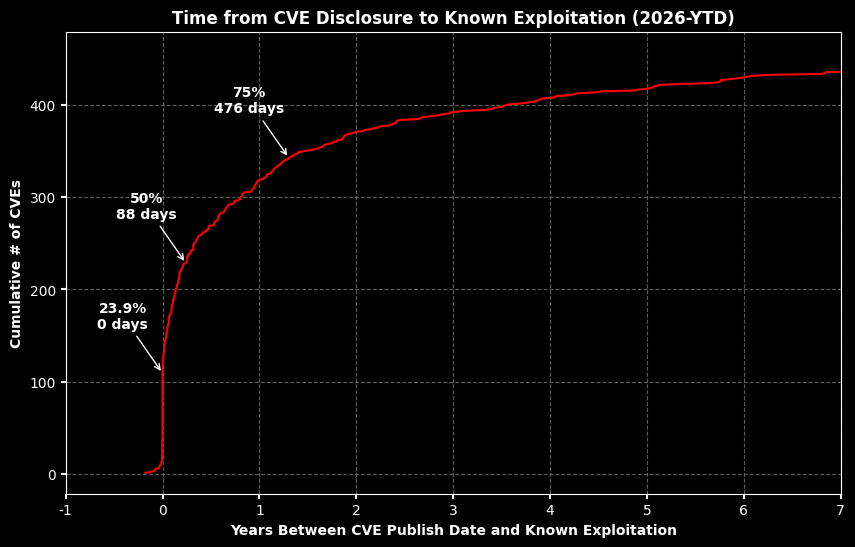
2025 Time from CVE disclosure to Exploitation
Source
# Ensure date columns are datetime
df['VulnCheck KEV Added Date'] = pd.to_datetime(df['VulnCheck KEV Added Date'], errors='coerce')
df['NVD Published Date'] = pd.to_datetime(df['NVD Published Date'], errors='coerce')

# Filter for rows where the VulnCheck KEV Added Date is in 2025
df_2025 = df[df['VulnCheck KEV Added Date'].dt.year == 2025].copy()

# Calculate the number of days between the two dates
df_2025.loc[:, 'Days Between'] = (df_2025['VulnCheck KEV Added Date'] - df_2025['NVD Published Date']).dt.days

# Drop rows where 'Days Between' is NaN (either date is missing)
df_2025 = df_2025.dropna(subset=['Days Between'])

# Sort by the 'Days Between' to prepare for cumulative counting
df_2025 = df_2025.sort_values(by='Days Between').reset_index(drop=True)

# Create a cumulative count of CVEs
df_2025['Cumulative CVEs'] = df_2025.index + 1

# Calculate the percentage of CVEs with 'Days Between' <= 0
percent_zero_or_less = (df_2025[df_2025['Days Between'] <= 0].shape[0] / df_2025.shape[0]) * 100
days_zero_or_less = 0  # Days for the <= 0 group

# Calculate 50% and 75% cumulative CVE count values
cve_50 = df_2025['Cumulative CVEs'].max() * 0.50
cve_75 = df_2025['Cumulative CVEs'].max() * 0.75

# Find the corresponding day values closest to these cumulative markers
days_50 = df_2025[df_2025['Cumulative CVEs'] >= cve_50].iloc[0]['Days Between']
days_75 = df_2025[df_2025['Cumulative CVEs'] >= cve_75].iloc[0]['Days Between']

# Set up dark mode for the plot
plt.style.use('dark_background')

# Plot the cumulative count with x-axis based on days, but labels as years
plt.figure(figsize=(10, 6))
plt.plot(df_2025['Days Between'], df_2025['Cumulative CVEs'], linestyle='-', color='red')

# Customize x-axis to show labels in years
tick_positions = [i * 365 for i in range(-1, 8)]
tick_labels = [str(i) for i in range(-1, 8)]
plt.xticks(tick_positions, tick_labels)

# Limit x-axis to 8 years, starting at -1 year (approximately -365 to 2555 days)
plt.xlim(-365, 2555)
plt.xlabel('Years Between CVE Publish Date and Known Exploitation', color='white', fontweight='bold')
plt.ylabel('Cumulative # of CVEs', color='white', fontweight='bold')
plt.title('Time from CVE Disclosure to Known Exploitation (2025)', color='white', fontweight='bold')

# Define annotations for "25%" (<= 0 days), 50%, and 75%
annotations = [
    (days_zero_or_less, df_2025[df_2025['Days Between'] <= 0].shape[0],
     f'{percent_zero_or_less:.1f}%\n{int(days_zero_or_less)} days', 'white'),
    (days_50, cve_50, f'50%\n{int(days_50)} days', 'white'),
    (days_75, cve_75, f'75%\n{int(days_75)} days', 'white')
]

# Add annotations with arrows, offsetting to the left with shorter arrows
for days, cve, label, color in annotations:
    plt.annotate(
        f'{label}',
        xy=(days, cve),
        xytext=(days - 150, cve + 0.1 * df_2025['Cumulative CVEs'].max()),
        textcoords='data',
        arrowprops=dict(arrowstyle="->", color=color, lw=1),
        ha='center', va='bottom',
        fontsize=10, color=color, fontweight='bold'
    )

# Customize grid and tick colors for better visibility on a dark background
plt.grid(True, color='gray', linestyle='--', alpha=0.7)
plt.tick_params(colors='white', labelsize=10, width=1.5)

plt.show()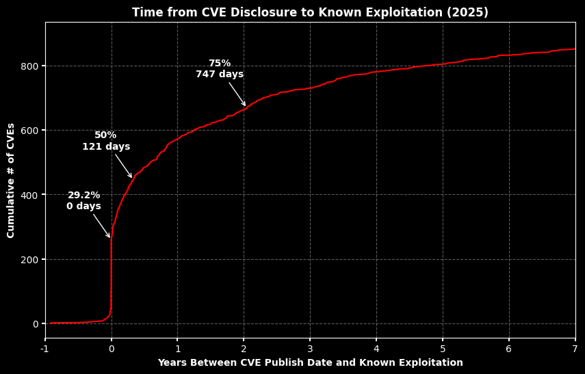
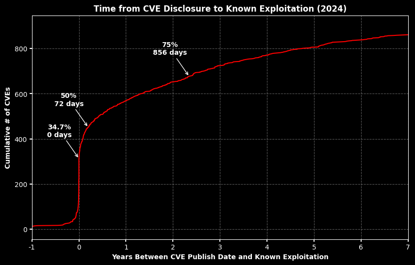
2024 Time from CVE disclosure to Exploitation
Source
# Filter for rows where the VulnCheck KEV Added Date is in 2024
df_2024 = df[df['VulnCheck KEV Added Date'].dt.year == 2024].copy()

# Calculate the number of days between the two dates
df_2024.loc[:, 'Days Between'] = (df_2024['VulnCheck KEV Added Date'] - df_2024['NVD Published Date']).dt.days

# Drop rows where 'Days Between' is NaN (either date is missing)
df_2024 = df_2024.dropna(subset=['Days Between'])

# Sort by the 'Days Between' to prepare for cumulative counting
df_2024 = df_2024.sort_values(by='Days Between').reset_index(drop=True)

# Create a cumulative count of CVEs
df_2024['Cumulative CVEs'] = df_2024.index + 1

# Calculate the percentage of CVEs with 'Days Between' <= 0
percent_zero_or_less = (df_2024[df_2024['Days Between'] <= 0].shape[0] / df_2024.shape[0]) * 100
days_zero_or_less = 0  # Days for the <= 0 group

# Calculate 50% and 75% cumulative CVE count values
cve_50 = df_2024['Cumulative CVEs'].max() * 0.50
cve_75 = df_2024['Cumulative CVEs'].max() * 0.75

# Find the corresponding day values closest to these cumulative markers
days_50 = df_2024[df_2024['Cumulative CVEs'] >= cve_50].iloc[0]['Days Between']
days_75 = df_2024[df_2024['Cumulative CVEs'] >= cve_75].iloc[0]['Days Between']

# Set up dark mode for the plot
plt.style.use('dark_background')

# Plot the cumulative count with x-axis based on days, but labels as years
plt.figure(figsize=(10, 6))
plt.plot(df_2024['Days Between'], df_2024['Cumulative CVEs'], linestyle='-', color='red')

# Customize x-axis to show labels in years
tick_positions = [i * 365 for i in range(-1, 8)]
tick_labels = [str(i) for i in range(-1, 8)]
plt.xticks(tick_positions, tick_labels)

# Limit x-axis to 8 years, starting at -1 year (approximately -365 to 2555 days)
plt.xlim(-365, 2555)
plt.xlabel('Years Between CVE Publish Date and Known Exploitation', color='white', fontweight='bold')
plt.ylabel('Cumulative # of CVEs', color='white', fontweight='bold')
plt.title('Time from CVE Disclosure to Known Exploitation (2024)', color='white', fontweight='bold')

# Define annotations for "25%" (<= 0 days), 50%, and 75%
annotations = [
    (days_zero_or_less, df_2024[df_2024['Days Between'] <= 0].shape[0],
     f'{percent_zero_or_less:.1f}%\n{int(days_zero_or_less)} days', 'white'),
    (days_50, cve_50, f'50%\n{int(days_50)} days', 'white'),
    (days_75, cve_75, f'75%\n{int(days_75)} days', 'white')
]

# Add annotations with arrows, offsetting to the left with shorter arrows
for days, cve, label, color in annotations:
    plt.annotate(
        f'{label}',
        xy=(days, cve),
        xytext=(days - 150, cve + 0.1 * df_2024['Cumulative CVEs'].max()),
        textcoords='data',
        arrowprops=dict(arrowstyle="->", color=color, lw=1),
        ha='center', va='bottom',
        fontsize=10, color=color, fontweight='bold'
    )

# Customize grid and tick colors for better visibility on a dark background
plt.grid(True, color='gray', linestyle='--', alpha=0.7)
plt.tick_params(colors='white', labelsize=10, width=1.5)

plt.show()
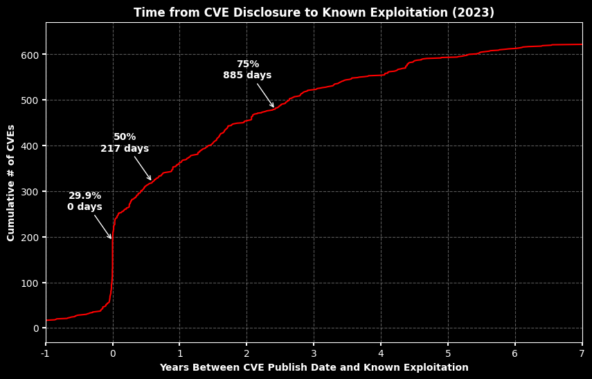
2023 Time from CVE disclosure to Exploitation
Source
# Ensure date columns are in datetime format
df['NVD Published Date'] = pd.to_datetime(df['NVD Published Date'], errors='coerce')
df['VulnCheck KEV Added Date'] = pd.to_datetime(df['VulnCheck KEV Added Date'], errors='coerce')

# Filter for rows where the VulnCheck KEV Added Date is in 2023
df_2023 = df[df['VulnCheck KEV Added Date'].dt.year == 2023].copy()

# Calculate the number of days between the two dates
df_2023.loc[:, 'Days Between'] = (df_2023['VulnCheck KEV Added Date'] - df_2023['NVD Published Date']).dt.days

# Drop rows where 'Days Between' is NaN (either date is missing)
df_2023 = df_2023.dropna(subset=['Days Between'])

# Sort by the 'Days Between' to prepare for cumulative counting
df_2023 = df_2023.sort_values(by='Days Between').reset_index(drop=True)

# Create a cumulative count of CVEs
df_2023['Cumulative CVEs'] = df_2023.index + 1

# Calculate the percentage of CVEs with 'Days Between' <= 0
percent_zero_or_less = (df_2023[df_2023['Days Between'] <= 0].shape[0] / df_2023.shape[0]) * 100
days_zero_or_less = 0  # Days for the <= 0 group

# Calculate 50% and 75% cumulative CVE count values
cve_50 = df_2023['Cumulative CVEs'].max() * 0.50
cve_75 = df_2023['Cumulative CVEs'].max() * 0.75

# Find the corresponding day values closest to these cumulative markers
days_50 = df_2023[df_2023['Cumulative CVEs'] >= cve_50].iloc[0]['Days Between']
days_75 = df_2023[df_2023['Cumulative CVEs'] >= cve_75].iloc[0]['Days Between']

# Set up dark mode for the plot
plt.style.use('dark_background')

# Plot the cumulative count with x-axis based on days, but labels as years
plt.figure(figsize=(10, 6))
plt.plot(df_2023['Days Between'], df_2023['Cumulative CVEs'], linestyle='-', color='red')

# Customize x-axis to show labels in years
tick_positions = [i * 365 for i in range(-1, 8)]
tick_labels = [str(i) for i in range(-1, 8)]
plt.xticks(tick_positions, tick_labels)

# Limit x-axis to 8 years, starting at -1 year (approximately -365 to 2555 days)
plt.xlim(-365, 2555)
plt.xlabel('Years Between CVE Publish Date and Known Exploitation', color='white', fontweight='bold')
plt.ylabel('Cumulative # of CVEs', color='white', fontweight='bold')
plt.title('Time from CVE Disclosure to Known Exploitation (2023)', color='white', fontweight='bold')

# Define annotations for "25%" (<= 0 days), 50%, and 75%
annotations = [
    (days_zero_or_less, df_2023[df_2023['Days Between'] <= 0].shape[0],
     f'{percent_zero_or_less:.1f}%\n{int(days_zero_or_less)} days', 'white'),
    (days_50, cve_50, f'50%\n{int(days_50)} days', 'white'),
    (days_75, cve_75, f'75%\n{int(days_75)} days', 'white')
]

# Add annotations with arrows, offsetting to the left with shorter arrows
for days, cve, label, color in annotations:
    plt.annotate(
        f'{label}',
        xy=(days, cve),
        xytext=(days - 150, cve + 0.1 * df_2023['Cumulative CVEs'].max()),
        textcoords='data',
        arrowprops=dict(arrowstyle="->", color=color, lw=1),
        ha='center', va='bottom',
        fontsize=10, color=color, fontweight='bold'
    )

# Customize grid and tick colors for better visibility on a dark background
plt.grid(True, color='gray', linestyle='--', alpha=0.7)
plt.tick_params(colors='white', labelsize=10, width=1.5)

plt.show()
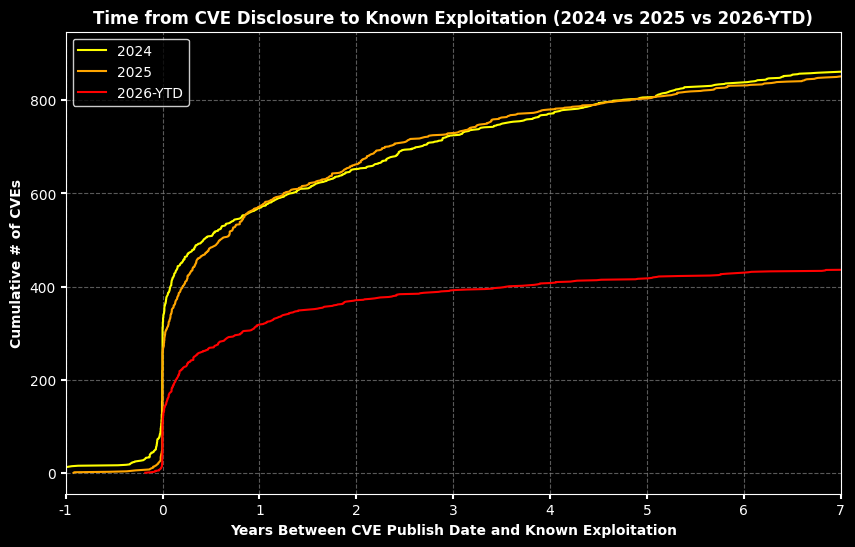
2024/2025/2026 Time from CVE disclosure to Exploitation
Source
# Filter for rows where the VulnCheck KEV Added Date is in 2024
df_2024 = df[df['VulnCheck KEV Added Date'].dt.year == 2024].copy()
df_2024.loc[:, 'Days Between'] = (df_2024['VulnCheck KEV Added Date'] - df_2024['NVD Published Date']).dt.days
df_2024 = df_2024.dropna(subset=['Days Between']).sort_values(by='Days Between').reset_index(drop=True)
df_2024['Cumulative CVEs'] = df_2024.index + 1

# Filter for rows where the VulnCheck KEV Added Date is in 2025
df_2025 = df[df['VulnCheck KEV Added Date'].dt.year == 2025].copy()
df_2025.loc[:, 'Days Between'] = (df_2025['VulnCheck KEV Added Date'] - df_2025['NVD Published Date']).dt.days
df_2025 = df_2025.dropna(subset=['Days Between']).sort_values(by='Days Between').reset_index(drop=True)
df_2025['Cumulative CVEs'] = df_2025.index + 1

# Filter for rows where the VulnCheck KEV Added Date is in 2026
df_2026 = df[df['VulnCheck KEV Added Date'].dt.year == 2026].copy()
df_2026.loc[:, 'Days Between'] = (df_2026['VulnCheck KEV Added Date'] - df_2026['NVD Published Date']).dt.days
df_2026 = df_2026.dropna(subset=['Days Between']).sort_values(by='Days Between').reset_index(drop=True)
df_2026['Cumulative CVEs'] = df_2026.index + 1

# Set up dark mode for the plot
plt.style.use('dark_background')
plt.figure(figsize=(10, 6))

# Plot the cumulative counts for 2024, 2025, and 2026
plt.plot(df_2024['Days Between'], df_2024['Cumulative CVEs'], linestyle='-', color='yellow', label='2024')
plt.plot(df_2025['Days Between'], df_2025['Cumulative CVEs'], linestyle='-', color='orange', label='2025')
plt.plot(df_2026['Days Between'], df_2026['Cumulative CVEs'], linestyle='-', color='red', label='2026-YTD')

# Customize x-axis to show labels in years
tick_positions = [i * 365 for i in range(-1, 8)]
tick_labels = [str(i) for i in range(-1, 8)]
plt.xticks(tick_positions, tick_labels)

# Limit x-axis to 8 years, starting at -1 year (approximately -365 to 2555 days)
plt.xlim(-365, 2555)
plt.xlabel('Years Between CVE Publish Date and Known Exploitation', color='white', fontweight='bold')
plt.ylabel('Cumulative # of CVEs', color='white', fontweight='bold')
plt.title('Time from CVE Disclosure to Known Exploitation (2024 vs 2025 vs 2026-YTD)', color='white', fontweight='bold')

# Add a legend
plt.legend(loc='upper left', fontsize=10, facecolor='black', edgecolor='white', framealpha=0.8)

# Customize grid and tick colors for better visibility on a dark background
plt.grid(True, color='gray', linestyle='--', alpha=0.7)
plt.tick_params(colors='white', labelsize=10, width=1.5)

# Show the plot
plt.show()