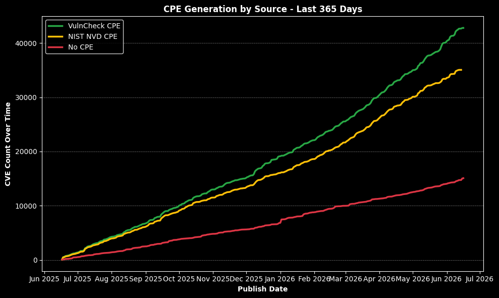
NIST NVD Status - Last 365 Days
Source
import matplotlib.pyplot as plt
from datetime import datetime, timedelta

# Filter DataFrame
df_cleaned = df[df["Published Date"] != datetime(1970, 1, 1).date()]

# Define custom colors
status_colors = {
    "Modified": "#94e1c1",
    "Deferred": "#000000",
    "Analyzed": "#00c893",
    "Awaiting Analysis": "#de425b",
    "Rejected": "#feba46",
    "Undergoing Analysis": "#6667ab",
    "Received": "#9c9ae3"
}

# Filter to past 365 days
cutoff_date = datetime.now().date() - timedelta(days=365)
recent_df = df_cleaned[df_cleaned["Published Date"] >= cutoff_date]

# Counts & labels
vuln_status_counts_recent = recent_df["Vuln Status"].value_counts()
total_recent = vuln_status_counts_recent.sum()
statuses_recent = vuln_status_counts_recent.index
colors_recent = [status_colors.get(status, "#cccccc") for status in statuses_recent]

labels_recent = [
    f"{status}: {count:,} ({(count / total_recent * 100):.1f}%)"
    for status, count in zip(statuses_recent, vuln_status_counts_recent)
]

# Dark mode styling
plt.style.use("dark_background")
fig, ax = plt.subplots(figsize=(10, 7), facecolor="#121212")
ax.set_facecolor("#121212")

wedges, _ = ax.pie(
    vuln_status_counts_recent,
    colors=colors_recent,
    startangle=140,
    wedgeprops={'width': 0.7},
    labels=None
)

ax.legend(
    wedges,
    labels_recent,
    title="Vuln Status",
    title_fontproperties={"weight": "bold"},
    prop={"weight": "bold", "size": 10, "family": "sans-serif"},
    loc="center left",
    bbox_to_anchor=(1, 0.5),
    frameon=False,
    labelcolor='white'
)

ax.set_title("NIST NVD Status - Last 365 Days", fontweight='bold', color='white')
ax.axis('equal')
plt.tight_layout()
plt.show()
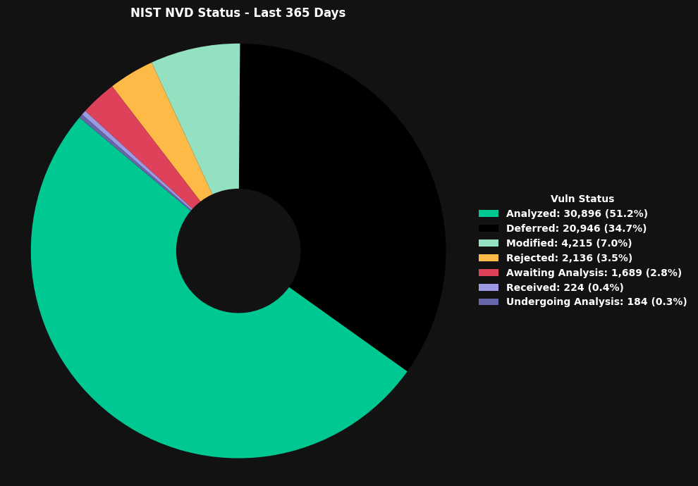
NIST NVD Status - All Time
Source
import matplotlib.pyplot as plt
from datetime import datetime

# Filter out invalid dates
df_cleaned = df[df["Published Date"] != datetime(1970, 1, 1).date()]

# Custom colors per status
status_colors = {
    "Modified": "#94e1c1",
    "Deferred": "#FFFFFF",
    "Analyzed": "#00c893",
    "Awaiting Analysis": "#de425b",
    "Rejected": "#feba46",
    "Undergoing Analysis": "#6667ab",
    "Received": "#9c9ae3"
}

# Counts & labels
vuln_status_counts_all = df_cleaned["Vuln Status"].value_counts()
total_all = vuln_status_counts_all.sum()
statuses_all = vuln_status_counts_all.index
colors_all = [status_colors.get(status, "#cccccc") for status in statuses_all]

labels_all = [
    f"{status}: {count:,} ({(count / total_all * 100):.1f}%)"
    for status, count in zip(statuses_all, vuln_status_counts_all)
]

# Dark mode styling
plt.style.use("dark_background")
fig, ax = plt.subplots(figsize=(10, 7), facecolor="#121212")
ax.set_facecolor("#121212")

wedges, _ = ax.pie(
    vuln_status_counts_all,
    colors=colors_all,
    startangle=140,
    wedgeprops={'width': 0.7},
    labels=None
)

ax.legend(
    wedges,
    labels_all,
    title="Vuln Status",
    title_fontproperties={"weight": "bold"},
    prop={"weight": "bold", "size": 10, "family": "sans-serif"},
    loc="center left",
    bbox_to_anchor=(1, 0.5),
    frameon=False,
    labelcolor='white'
)

ax.set_title("NIST NVD Status - All Time", fontweight='bold', color='white')
ax.axis('equal')
plt.tight_layout()
plt.show()
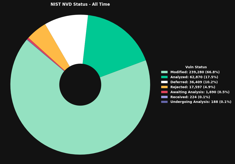
Top 50 CNAs by CVEs Published in Last 365 Days
Source
import matplotlib.pyplot as plt
import pandas as pd
import re
from datetime import datetime, timedelta

# Step 1: Filter out invalid publish dates and make an explicit copy
df_cleaned = df[df["Published Date"] != datetime(1970, 1, 1).date()].copy()

# Step 2: Extract name from Source Identifier, e.g., (Cisco)
df_cleaned["Source Name"] = df_cleaned["Source Identifier"].apply(
    lambda x: re.search(r"\((.*?)\)", x).group(1) if pd.notnull(x) and re.search(r"\((.*?)\)", x) else "Unknown"
)

# Step 3: Filter for CVEs published in the last 365 days
cutoff_date = datetime.now().date() - timedelta(days=365)
df_recent = df_cleaned[df_cleaned["Published Date"] >= cutoff_date]

# Step 4: Group by Source Name and get top 50
top_sources_recent = (
    df_recent.groupby("Source Name")
    .size()
    .sort_values(ascending=False)
    .head(50)
)

# Step 5: Plot horizontal bar chart in dark mode
plt.style.use("dark_background")
fig, ax = plt.subplots(figsize=(12, 10), facecolor="#121212")  # Slightly taller for 50 bars
ax.set_facecolor("#121212")

bars = ax.barh(
    top_sources_recent.index,
    top_sources_recent.values,
    color="#00c893"
)

# Formatting
ax.invert_yaxis()  # Most CVEs at top
ax.set_title("Top 50 CNAs by CVEs Published in Last 365 Days", fontweight="bold", color="white")
ax.set_xlabel("Number of CVEs", fontweight="bold", color="white")
ax.set_ylabel("CNA", fontweight="bold", color="white")

# Axis tick styling
ax.tick_params(axis='x', colors='white')
ax.tick_params(axis='y', colors='white')

# Add labels to bars
for bar in bars:
    width = bar.get_width()
    ax.text(
        width + 1,
        bar.get_y() + bar.get_height() / 2,
        f"{int(width):,}",
        va='center',
        ha='left',
        color='white',
        fontweight='bold'
    )

plt.tight_layout()
plt.show()
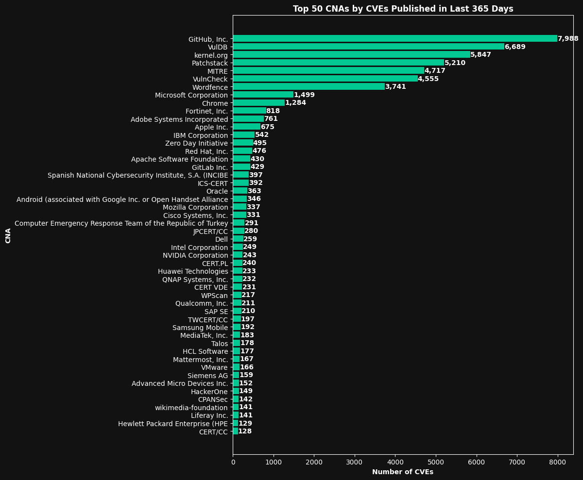
CPE Generation by Source (Vulncheck vs. NIST) - Last 365 Days
Source
from datetime import datetime, timedelta
import pandas as pd
import matplotlib.pyplot as plt
import matplotlib.dates as mdates

# Ensure your datetime range
one_year_ago = datetime.now() - timedelta(days=365)

# Ensure 'Published Date' is in Timestamp format
df_temp = df.copy()
df_temp['Published Date'] = pd.to_datetime(df_temp['Published Date'])

# Filter to last 365 days
filtered_df = df_temp[df_temp['Published Date'] >= one_year_ago]

# Filter categories
vc_config_true = filtered_df[filtered_df['Has VC Configurations'] == True]
nvd_cpe_true = filtered_df[filtered_df['Has Configurations'] == True]
no_cpe = filtered_df[
    (filtered_df['Has VC Configurations'] == False) &
    (filtered_df['Has Configurations'] == False)
]

# Cumulative counts by publish date
vc_config_count = vc_config_true.groupby('Published Date').size().cumsum()
nvd_cpe_count = nvd_cpe_true.groupby('Published Date').size().cumsum()
no_cpe_count = no_cpe.groupby('Published Date').size().cumsum()

# Plotting
line_colors = {
    'VulnCheck CPE': '#28a745',
    'NIST NVD CPE': '#ffc008',
    'No CPE': '#dc3544'
}

plt.style.use('dark_background')
plt.figure(figsize=(10, 6))

plt.plot(vc_config_count.index, vc_config_count.values,
         label='VulnCheck CPE', color=line_colors['VulnCheck CPE'], linewidth=2.5)
plt.plot(nvd_cpe_count.index, nvd_cpe_count.values,
         label='NIST NVD CPE', color=line_colors['NIST NVD CPE'], linewidth=2.5)
plt.plot(no_cpe_count.index, no_cpe_count.values,
         label='No CPE', color=line_colors['No CPE'], linewidth=2.5)

plt.xlabel('Publish Date', color='white', fontweight='bold')
plt.ylabel('CVE Count Over Time', color='white', fontweight='bold')
plt.title('CPE Generation by Source - Last 365 Days', color='white', fontweight='bold')
plt.legend(facecolor='black', edgecolor='white', loc='upper left')

plt.gca().xaxis.set_major_formatter(mdates.DateFormatter('%b %Y'))
plt.gca().xaxis.set_major_locator(mdates.MonthLocator())
plt.grid(axis='y', color='gray', linestyle='--', linewidth=0.5)

plt.tight_layout()
plt.show()